Energy Colour Resonance
One-Line Pitch
Energy perception expressed as intuitive colour frequencies rather than visual imagery — a framework that turns a supposed limitation (aphantasia, abstract sensing) into a precise, reliable energetic language.
EchoCraft Subskill · Class: Energetic Perception — Colour Frequency Reading — Dual-Modality Sensing
The Core Principle
Standard remote viewing and energetic perception frameworks are built for visual thinkers. They ask you to "see" a location, to "visualise" a presence, to form a mental image of what you're sensing. For practitioners with aphantasia — the inability to form voluntary mental imagery — these frameworks produce nothing.
Energy Colour Resonance is a different entry point.
Rather than visualising a thing, you tune into its resonance frequency and receive that frequency as intuitive colour impression. No image required. The colour is the signal — a rapid, reliable readout of a location's fundamental energetic character.
Aphantasia isn't a limitation here. It is a clarifying gift. Without the surface visual layer, you are forced deeper — into the underlying energetic realities rather than the imagined surface. The colour impression that results is often more accurate than a visualised image precisely because there is less to confuse with imagination.
The Energy Colour Spectrum
| Colour | Energetic Signature |
|---|---|
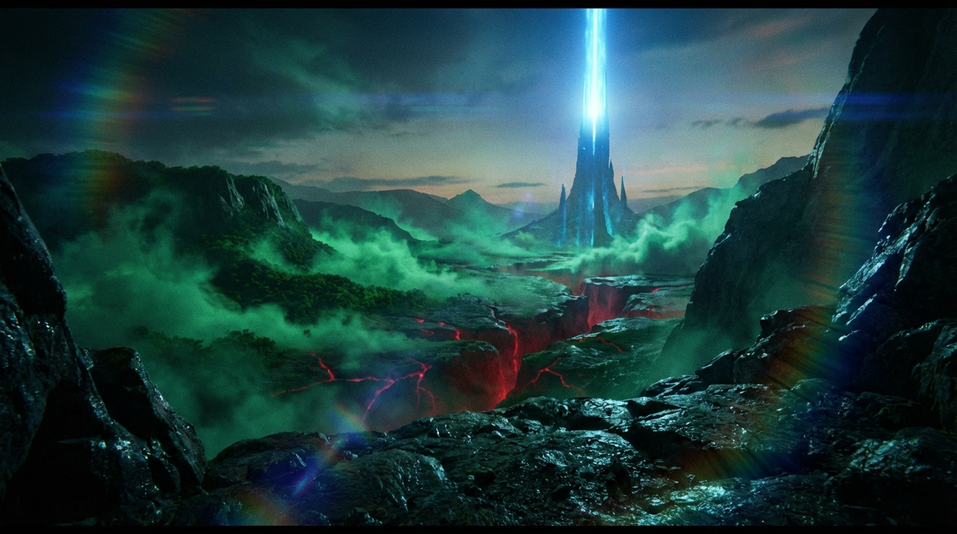
| Green | Natural landscapes, growth terrain, living fields — strong and unmistakable |
| Blue | Sacred or spiritual structures, expansive clear presence — high and spacious |
| Red / Deep Red | Hidden or occult locations, concealed forces, underground pressures — vivid and urgent |
| Gold / Amber | Historical depth, ancient presence, accumulated human resonance |
| White / Silver | High clarity, purified or recently cleared field states |
| Grey / Murk | Entropy, confusion, contested or degraded fields |
| Violet | Intentional field work, practitioner-modified spaces, residual ritual presence |
These are not absolute. They are one practitioner's calibrated vocabulary. The discipline is developing your consistent colour language rather than memorising a universal chart.
How to Use It
🎯 First Impression Protocol
When tuning into a location or presence, receive the first colour impression without filtering it. The first colour is the signal. Analysis comes after. Do not override or reinterpret the immediate colour impression with logic — that's the moment you re-enter the visual/analytical layer and lose the resonance read.
🌐 Remote Location Sensing
Hold the location in intention — not as a visualised image, but as a named, oriented focus. What colour is it? The impression arrives immediately or within a few seconds. Natural landscapes return strong, clear Green. Sacred structures return Blue. Hidden or pressured places return Red with unusual vividness.
🔷 Dual-Modality Sensing
Advanced practice combines colour resonance with geometric symbolic impression — fractal energetic structure (see Void Physics). Colour tells you the nature of the energy. Geometric shape tells you its architecture. Together they produce a richer energetic profile than either alone.
Practical Field Application
Example: Remote sensing a location before travel
- Orient your attention toward the location — hold the name or image of its general region
- Receive the colour: what is the first impression?
- Strong clear Green → natural, alive, conducive to presence work
- Vivid Red → something is hidden, pressured, or operating below the surface
- Murky Grey → contested, entropy-dominant, unclear outcome
- Cross-reference with geometric impression if available
- Trust the read as genuine resonance data, not imagination
The most common failure mode is second-guessing the first impression. "That can't be right — I know this is a calm place." The second thought is the analytical mind reclaiming control. The first colour impression is the resonance read. They are not the same source.
Calibration Practice
Track your colour readings against observed reality. Keep notes on first-impression colours and what you actually encountered. Over time, you develop a refined personal colour vocabulary — what each colour consistently corresponds to in your perceptual system.
This is the practice. Not studying the colour map above. Building your own.
Related Subskills
Void Physics and Intuition Language→ describes the geometric dimension that pairs with colour to form dual-modality sensing. Fractal Void Physics: Intent and Precog→ explains the deeper architecture these colour impressions are operating within. Intent Imprinting→ uses colour resonance to verify that an imprint has taken hold — the field-colour shifts toward the intended state when the imprint is successful.